Statistical Insights: What does household debt say about financial resilience?

by Isabelle Ynesta, Financial Statistics Statistician and Matthew De Queljoe, Statistician, OECD Statistics Directorate
Household debt levels increased rapidly in many economies in the run-up to the 2007-2008 financial crisis, fuelled in part by easy credit and rising property prices. Ratios of debt to annual income – used by lenders to determine households’ repayment capacity – then reached record highs across OECD countries. These debt levels have since continued to rise in most OECD countries, albeit at a much slower pace, both in real terms and as a multiple of annual disposable income. What does this say about households’ financial resilience?
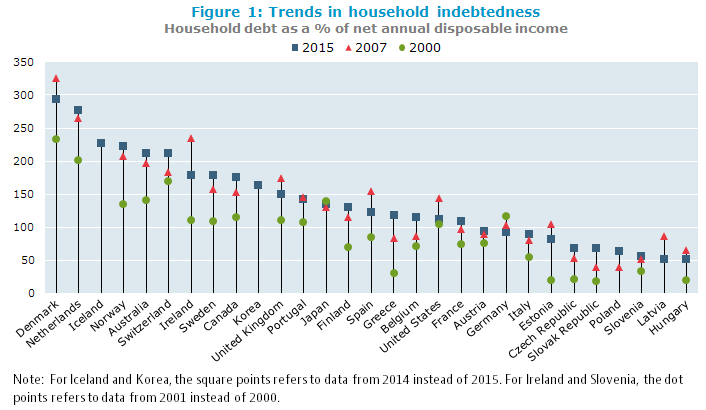
Household indebtedness ratios have trended up since 2000, but the rise has slowed considerably since 2007 in most OECD countries
Household indebtedness ratios have been trending up since 2000 in nearly all OECD countries, with the notable exceptions of Japan and Germany. Most of the accumulation of debt occurred in the run‑up to the financial crisis, in the period 2000-2007, when households increased their borrowings in response to greater access to credit and increasing house prices, most spectacularly in Ireland where indebtedness went from 111% of annual disposal income in 2001 to 234% in 2007 (figure 1). Following the crisis, the increase in indebtedness slowed considerably in many OECD countries, and even reversed in some of them, as households redeemed their debt and limited new borrowings. The sharpest falls were in Ireland (down 56 percentage points from 2007), Latvia (down 34 percentage points), Spain (down 33 percentage points), Denmark (down 32 percentage points), and the United States (down 31 percentage points).
Loans, predominantly mortgage loans, make up the largest component of household debt. When real estate prices increase, households must borrow larger amounts to buy a house. Existing homeowners may also feel richer and borrow against their increased collateral to fund spending on consumer goods and services (Statistical Insights: Blowing bubbles? Developments in house prices). Both phenomena were observed in countries where housing bubbles occurred, and contributed to increasing household debt levels in countries such as Denmark, the Netherlands, Spain, the United States, and the United Kingdom.
On the other hand, Japan and Germany did not experience housing booms and their household debt levels fell over the period 2000-2015. Japanese households tended to accumulate large down‑payments before borrowing to buy a house, and existing owners did not extract equity from their houses by increasing their mortgages. In Germany, a key factor is a low home ownership rate relative to other OECD countries.
Household indebtedness ratios can vary widely across countries
Figure 1 also shows that Danish households had the highest indebtedness ratio in 2015 at 293% of annual disposable income, followed by the Netherlands at 276%, whereas Hungary had the lowest at 51% (figure 1). These ratios, however, may not be the best measure of households’ financial resilience, which must also take account of factors such as the level of interest rates, whether mortgages are at fixed or floating rates, and whether tax breaks apply to mortgage interest. In the Netherlands, for example, households can deduct interest paid on mortgage loans from their taxable income, which may partly explain why Dutch mortgages are among the highest in Europe in relation to the value of the underlying collateral.
But to better understand households’ financial resilience assets matter too
To gain a better understanding of households’ vulnerability to economic shocks – such as becoming unemployed – one should also look at the assets they have available to pay down debt. Clearly, having a low debt-to-assets ratio will increase households’ resilience to shocks. However, the assets side of the ratio can be significantly affected by how pension systems work in various countries. Where future pension liabilities are already funded, this will increase households’ assets. This is the case in the Netherlands and Australia, where funded pension schemes are well developed, and pension assets represented 60% and 56%, respectively, of households’ total financial assets in 2015. At the other end of the spectrum, Belgian households’ pension assets only accounted for 6.5% of their total financial assets, since most pensions are funded on a pay-as-you-go system.
Household debt-to-assets ratios rose after 2000 in most OECD countries,
but the picture is mixed since 2007

The debt-to-assets ratio in 2015 for Denmark, the Netherlands and the United States, countries that experienced a housing bubble, was more or less the same as in 2000 and around 5 percentage points less than in 2007. On the other hand, the debt-to-assets ratio increased considerably between 2000 and 2015 in the Slovak Republic, Greece and Estonia, although from a low base. In the Slovak Republic, the easing of credit restrictions, and the launching of mortgage banking in 2000, made loans more readily available. Since 2007 the debt-to-assets ratio has continued to increase in the Slovak Republic and Greece whereas it fell in Estonia. Household financial resilience depends on the distribution of assets, liabilities and income and the institutional factors prevailing in each country, but in general, debt-to-assets ratios that are trending up indicate that households are becoming less resilient to shocks.
A final remark concerns the distribution of assets and debt. While a country’s average numbers may look comforting, the distribution of assets and debt could be skewed, making certain groups in society very vulnerable to various types of economic shock. The OECD therefore invests considerable effort in obtaining information broken down by various household groups. Preliminary results of this work can be found in “Measuring inequality in income and consumption in a national accounts framework, OECD Statistics Brief, November 2014 – No. 19″ and “Household wealth inequality across OECD countries: new OECD evidence, OECD Statistics Brief, June 2015 – No. 21″.
The measures explained
Household net disposable income: Total annual income received by households after deducting taxes on income and wealth and social contributions, and including monetary social benefits (such as unemployment benefits). This measure thus represents the amount left at the disposal of households for either consumption or saving. It is called “net” because amounts needed to replace capital assets (dwellings and equipment of unincorporated enterprises) are already deducted.
Household indebtedness ratio: Households’ total outstanding debt divided by their annual net disposable income. The debt of households largely consists of loans, primarily home mortgage loans, but also other types of liabilities such as consumer debt (e.g., credit cards, automobile loans).
An indebtedness ratio above (below) 100 percent indicates that the household debt outstanding is larger (smaller) than the annual flow of net disposable income.
Household debt-to-total-assets ratio: Households’ total outstanding debt divided by their total assets. The total assets of households consist of both financial assets (saving deposits, shares and other equity, pension entitlements etc.) and non-financial assets (predominantly residential real estate including both dwellings and land, though due to data limitations, only the value of dwellings is included in the figures shown here).
The higher (lower) the debt-to-total-assets ratio, the higher (lower) is the level of households’ leverage, and the weaker (stronger) is their financial position.
Where to find the underlying data?
- Financial Dashboard: this dataset contains data on households’ financial wealth and on households’ debt
- Household Dashboard includes indicators related to the household sector published on a quarterly frequency
Household annual and quarterly financial accounts and financial balance sheet data can be found at:
Annual data
Quarterly data
- Non-consolidated financial transactions by economic sector (Quarterly table 0620)
- Non-consolidated financial balance sheets by economic sector (Quarterly table 0720)
- Households’ financial assets and liabilities present a more granular breakdown of households’ financial assets and liabilities.
Further reading
- European Commission; IMF; OECD; UN; and World Bank (2009), “System of National Accounts 2008“
- Lequiller, F. and D. Blades (2014), Understanding National Accounts: Second Edition, OECD Publishing, Paris.
| Contact: for further information, please contact the OECD Statistics Directorate at stat.contact@oecd.org. |

