Statistical Insights: What does household debt say about financial resilience?

Stat-Insights-200_fw


by Isabelle Ynesta, Financial Statistics Statistician and Matthew De Queljoe, Statistician, OECD Statistics Directorate

Household debt levels increased rapidly in many economies in the run-up to the 2007-2008 financial crisis, fuelled in part by easy credit and rising property prices. Ratios of debt to annual income – used by lenders to determine households’ repayment capacity – then reached record highs across OECD countries. These debt levels have since continued to rise in most OECD countries, albeit at a much slower pace, both in real terms and as a multiple of annual disposable income. What does this say about households’ financial resilience?

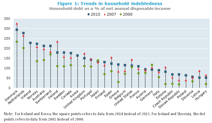
Household indebtedness ratios have trended up since 2000, but the rise has slowed considerably since 2007 in most OECD countries 

Household indebtedness ratios have been trending up since 2000 in nearly all OECD countries, with the notable exceptions of Japan and Germany. Most of the accumulation of debt occurred in the run‑up to the financial crisis, in the period 2000-2007, when households increased their borrowings in response to greater access to credit and increasing house prices, most spectacularly in Ireland where indebtedness went from 111% of annual disposal income in 2001 to 234% in 2007 (figure 1). Following the crisis, the increase in indebtedness slowed considerably in many OECD countries, and even reversed in some of them, as households redeemed their debt and limited new borrowings. The sharpest falls were in Ireland (down 56 percentage points from 2007), Latvia (down 34 percentage points), Spain (down 33 percentage points), Denmark (down 32 percentage points), and the United States (down 31 percentage points).
StatI1Sept2017

Loans, predominantly mortgage loans, make up the largest component of household debt. When real estate prices increase, households must borrow larger amounts to buy a house. Existing homeowners may also feel richer and borrow against their increased collateral to fund spending on consumer goods and services (Statistical Insights: Blowing bubbles? Developments in house prices). Both phenomena were observed in countries where housing bubbles occurred, and contributed to increasing household debt levels in countries such as Denmark, the Netherlands, Spain, the United States, and the United Kingdom.

On the other hand, Japan and Germany did not experience housing booms and their household debt levels fell over the period 2000-2015. Japanese households tended to accumulate large down‑payments before borrowing to buy a house, and existing owners did not extract equity from their houses by increasing their mortgages. In Germany, a key factor is a low home ownership rate relative to other OECD countries.

Household indebtedness ratios can vary widely across countries

Figure 1 also shows that Danish households had the highest indebtedness ratio in 2015 at 293% of annual disposable income, followed by the Netherlands at 276%, whereas Hungary had the lowest at 51% (figure 1). These ratios, however, may not be the best measure of households’ financial resilience, which must also take account of factors such as the level of interest rates, whether mortgages are at fixed or floating rates, and whether tax breaks apply to mortgage interest. In the Netherlands, for example, households can deduct interest paid on mortgage loans from their taxable income, which may partly explain why Dutch mortgages are among the highest in Europe in relation to the value of the underlying collateral.

But to better understand households’ financial resilience assets matter too

To gain a better understanding of households’ vulnerability to economic shocks – such as becoming unemployed – one should also look at the assets they have available to pay down debt. Clearly, having a low debt-to-assets ratio will increase households’ resilience to shocks. However, the assets side of the ratio can be significantly affected by how pension systems work in various countries. Where future pension liabilities are already funded, this will increase households’ assets. This is the case in the Netherlands and Australia, where funded pension schemes are well developed, and pension assets represented 60% and 56%, respectively, of households’ total financial assets in 2015. At the other end of the spectrum, Belgian households’ pension assets only accounted for 6.5% of their total financial assets, since most pensions are funded on a pay-as-you-go system.

Household debt-to-assets ratios rose after 2000 in most OECD countries,
but the picture is mixed since 2007

StatISept2017

The debt-to-assets ratio in 2015 for Denmark, the Netherlands and the United States, countries that experienced a housing bubble, was more or less the same as in 2000 and around 5 percentage points less than in 2007. On the other hand, the debt-to-assets ratio increased considerably between 2000 and 2015 in the Slovak Republic, Greece and Estonia, although from a low base. In the Slovak Republic, the easing of credit restrictions, and the launching of mortgage banking in 2000, made loans more readily available. Since 2007 the debt-to-assets ratio has continued to increase in the Slovak Republic and Greece whereas it fell in Estonia. Household financial resilience depends on the distribution of assets, liabilities and income and the institutional factors prevailing in each country, but in general, debt-to-assets ratios that are trending up indicate that households are becoming less resilient to shocks.

A final remark concerns the distribution of assets and debt. While a country’s average numbers may look comforting, the distribution of assets and debt could be skewed, making certain groups in society very vulnerable to various types of economic shock. The OECD therefore invests considerable effort in obtaining information broken down by various household groups. Preliminary results of this work can be found in “Measuring inequality in income and consumption in a national accounts framework, OECD Statistics Brief, November 2014 – No. 19″ and “Household wealth inequality across OECD countries: new OECD evidence, OECD Statistics Brief, June 2015 – No. 21″.

The measures explained

Household net disposable income: Total annual income received by households after deducting taxes on income and wealth and social contributions, and including monetary social benefits (such as unemployment benefits). This measure thus represents the amount left at the disposal of households for either consumption or saving. It is called “net” because amounts needed to replace capital assets (dwellings and equipment of unincorporated enterprises) are already deducted.

Household indebtedness ratio: Households’ total outstanding debt divided by their annual net disposable income. The debt of households largely consists of loans, primarily home mortgage loans, but also other types of liabilities such as consumer debt (e.g., credit cards, automobile loans).

An indebtedness ratio above (below) 100 percent indicates that the household debt outstanding is larger (smaller) than the annual flow of net disposable income.

Household debt-to-total-assets ratio: Households’ total outstanding debt divided by their total assets. The total assets of households consist of both financial assets (saving deposits, shares and other equity, pension entitlements etc.) and non-financial assets (predominantly residential real estate including both dwellings and land, though due to data limitations, only the value of dwellings is included in the figures shown here).

The higher (lower) the debt-to-total-assets ratio, the higher (lower) is the level of households’ leverage, and the weaker (stronger) is their financial position.

Where to find the underlying data?

  • Financial Dashboard: this dataset contains data on households’ financial wealth and on households’ debt
  • Household Dashboard includes indicators related to the household sector published on a quarterly frequency

Household annual and quarterly financial accounts and financial balance sheet data can be found at:

Annual data

Quarterly data

Further reading


Contact: for further information, please contact the OECD Statistics Directorate at stat.contact@oecd.org.


Insight from the OECD Household Dashboard: Why household incomes don’t always track changes in GDP

By Jennifer Ribarsky, Head of Sectoral and National Accounts, OECD Statistics Directorate

A key indicator of households’ material conditions, or economic well-being, is per capita household income, after deducting taxes and social contributions and including social benefits. It provides a better gauge than gross domestic product (GDP) of the resources households have at their disposal to buy goods and services or save for the future.

Over the very long term the average annual growth rates of the two statistics tend to be similar, since the incomes earned by households account for a large share of the total income generated through production in the economy, as recorded by GDP. However, over shorter time periods, especially during severe economic recessions or rapid expansions, trends in household disposable income and GDP may differ significantly. Many factors can contribute to such a divergence; for instance, changes in the government’s policies related to taxes or social benefits, or in how companies allocate their earnings between dividends, retained earnings and compensation of employees.

To see these factors in action, let’s look at recent data for Norway and Greece. Figure 1 shows how GDP and household income have evolved there since the first quarter of 2007, right before the start of the global financial crisis. The figure shows that in the crisis years 2008-2009, GDP per capita was falling in both countries, though faster in Greece. However, government intervention – though a reduced budget surplus in Norway and an increased deficit in Greece – cushioned households from the negative effects of the economic contraction.

stat insight household

Starting from 2010, the picture in the two countries becomes very different. With Greece’s fiscal deficit hitting 15% of GDP in 2009, the European sovereign debt crisis and a deep and prolonged recession, the government ended its support to household income. This retrenchment in government spending, as well as the substantial falls in compensation of employees and self-employed income, meant that household incomes in Greece began falling precipitously in 2010. Even though Greece’s per capita GDP has started to recover slightly in recent quarters, household disposable incomes today remain near their lowest levels since the precipitous decline.

Norwegian households have been in a much more favourable position. As a resource rich country, Norway’s  revenue from the oil and gas sector has for years resulted in large government surpluses that were channelled into a sovereign wealth fund. The Norwegian government continued to sustain household incomes after 2010 by reducing the surplus saved into the fund. However, government intervention was not the primary driver of the longer term Norwegian trend of household income growth outpacing GDP. Since 2007 the share of company earnings going to compensation of employees has increased, and the share going to dividends or retained earnings has declined. Rising employee compensation is thus the main reason for Norwegian household incomes growing 20% more than real GDP per capita since just before the crisis, though the gap has narrowed slightly in the last two years.

To see how households are doing in other OECD countries, visit our dashboard on households’ economic well-being which contains a range of household indicators and has recently been updated to include data through Q1 2017.

Further reading:

Ribarsky, J., C. Kang and E. Bolton  (2016), “The drivers of differences between growth in GDP and household adjusted disposable income in OECD countries“, OECD Statistics Working Papers, No. 2016/06, OECD Publishing, Paris.


Statistical Insights: Purchasing Power Parities – not only about Big Macs

Stat-Insights-200_fw

by Pierre-Alain Pionnier, Head of CLIs, Prices & Environmental Accounts Section, Francette Koechlin, Head of Prices & PPPs Unit, and Sophie Bournot, Statistician for PPPs, OECD Statistics Directorate

All travellers know that the prices of goods and services vary between countries. In order to capture these price differences, Eurostat and the OECD collect data on the prices of identical goods and services in their member countries, and compile “Purchasing Power Parities” (PPPs) – conversion rates that neutralise price differences between countries. The collection spans hundreds of products and allows PPPs to be calculated for various classes of goods and services, and for macroeconomic aggregates such as gross domestic product (GDP). PPPs help economists and other users of statistics who want to compare GDP, income and consumption across economies with a proper adjustment for price differentials, in order to better assess the size of economies, productivity and material well-being.

Purchasing power parities (PPPs) compare the prices of similar products, expressed in different currencies

The Big Mac index from The Economist magazine is a well-known example of an international price comparison of a product with similar characteristics across countries. In its latest edition (January 2017), this price comparison shows for instance that the average price of a Big Mac is 5 dollars in the United States and 4 euros in France. So the “Big Mac PPP” between France and the US is the ratio of 4 euros to 5 dollars (or equivalently 0.8 euro to the dollar).

Price relatives vary from product to product, so many products must be sampled to construct PPPs for entire economies

Because price relatives vary from product to product, the OECD and Eurostat collect prices on around 2,500 products. This allows PPPs to be constructed for different groups of products, and to compare price levels, once the prices have been converted into a single currency. This is illustrated in Figure 1, showing how prices for different product groups differ across countries.

The top part of Figure 1 shows that the prices of durable goods (e.g., cars, TVs and computers) vary less between countries than the prices of services (e.g., housing, education and health). This is because durable goods are frequently traded across countries, which tends to equalise their price levels. On the other hand, services are often purchased locally and are less traded across countries, thus making it possible to have larger price differences across countries. The comparison shows that services tend to be more expensive in high-income countries (e.g., Switzerland) than in lower-income countries (e.g., Mexico). This is the so-called Balassa-Samuelson effect: the higher productivity in advanced countries for the production of tradeable goods leads to higher wages across all sectors in these countries. Since cross-country differences in services productivity are smaller than in tradable goods productivity, these higher wages lead to higher services prices in advanced countries.

The bottom part of Figure 1 shows that overall consumption prices tend to be higher in high-income countries, reflecting the large share of services in the consumption basket of households (typically around 70%). Furthermore, overall consumption prices and Big Mac prices show a similar pattern, although for some countries the difference between Big Mac prices and overall consumption prices can be quite significant. In Australia for instance, Big Mac prices are close to the OECD average whereas overall prices for household final consumption are nearly 40% higher.

STD

Using the Eurostat-OECD PPPs is the best way to compare macroeconomic aggregates across OECD countries: better than using exchange rates or PPPs based on single products

Perhaps the most intuitive way to compare macroeconomic aggregates across countries when they are expressed in different currencies is to use exchange rates. However, such comparisons do not account for the fact that prices are different across countries, even if expressed in the same currency. Making it possible to adequately adjust for price differentials is precisely the purpose of PPPs.

Figure 2 shows that conclusions derived from international comparisons of per-capita household final consumption, a useful indicator of material well-being, vary significantly depending on whether exchange rates or PPPs are used to convert consumption in national currency to a common unit. In 2014, the differences reached up to 70% for Norway, where average consumption prices were well above the OECD average (see Figure 1). The difference between measures based on PPPs and relative Big Mac prices is usually lower. Nevertheless, and consistently with Figure 1, measures based on relative Big Mac prices tend to overstate consumption per capita in high-income countries and to understate it in lower-income countries, as compared to measures based on PPPs which take into account the whole range of goods and services consumed by households.

STD PPPs

The measures explained

Household actual individual consumption (AIC) is the measure of household final consumption used in this article. It covers all goods and services actually consumed by households, including both consumer goods and services purchased directly by them (“household final consumption expenditure”), and services provided by government and non-profit institutions for free or at significantly reduced prices (e.g. health and education services). In a nutshell, AIC measures what households consume and not only what they directly pay for.

Purchasing Power Parities (PPPs) convert different currencies to a common currency and, in the process of conversion, equalise their purchasing power by eliminating the differences in price levels between countries. Thus, when GDP or consumption values are converted to a common currency with PPPs, they are valued at the same price level and so reflect only differences in the volumes of goods and services purchased in the countries. In their simplest form, PPPs are nothing more than price relatives that show the ratio of the prices in national currencies of the same good or service in different countries. For example, as mentioned in the text, if the price of a Big Mac is 4 Euros in France and 5 Dollars in the United States, then the PPP for Big Macs between France and the United States is the ratio of 4 Euros to 5 Dollars, or 0.8 Euro to the Dollar, meaning that for every Dollar spent on a Big Mac in the United States, 0.8 Euro would be spent in France to obtain the same burger. If the currency exchange rate is one Euro to the Dollar, it can be concluded that Big Macs are cheaper in France than in the United States. The OECD and Eurostat compile PPPs for large baskets of goods and services.

Note that the Eurostat-OECD PPPs are not suitable for gauging the under- or overvaluation of currencies since PPPs cover the whole range of goods and services produced or consumed in an economy, including many non-tradeable ones. Furthermore, currency exchange rates are also affected by capital movements.

Where to find the underlying data?

The OECD database on PPPs is available on OECD.STAT and includes the following datasets:
> Annual PPPs and exchange rates: this dataset contains annual PPPs for GDP, household actual individual consumption and final consumption expenditure, as well exchange rates for OECD countries and some non-member economies.
> 2014 PPP benchmark results: this dataset contains the detailed results of the latest (2014) Eurostat-OECD price comparison for the 47 countries that participated in the 2014 round of the Eurostat-OECD PPP Programme. Similar detailed results are also available for 2011, 2008 and 2005.

In addition, The Economist’s online database contains local Big Mac prices in up to 56 countries from 2000 to 2017.

Further reading

> Bournot S., Koechlin F., Schreyer P. (2011): 2008 Benchmark PPPs: Measurement and Uses. OECD Statistics Brief No. 17

> OECD/Eurostat (2012), Eurostat-OECD Methodological Manual on Purchasing Power Parities (2012 Edition), OECD Publishing, Paris

> The Economist (2017), The Big Mac index. January 12th 2017 edition

OECD Purchasing Power Parities (PPPs), data and methodology

The World Bank International Comparison Program (ICP)  http://icp.worldbank.org


Productivity, productivity, wherefore art thou?  (Romeo and Juliet: Act 2, Scene 2)

First published on OECD Insights http://wp.me/p2v6oD-2vJ.

By OECD Statistics Directorate

Four hundred years after the death of Shakespeare there remain many misconceptions on what he wrote. Perhaps the most common concerns the adulterated quote above, which is actually a reference to why Romeo was a Montague rather than where Romeo was. In the same spirit of confusion, recent years have seen considerable debate about the causes of the productivity slowdown seen across OECD countries.

This year’s Productivity Compendium includes a special chapter that casts a spotlight on some of the potential villains stalking the stage, together with insights from the OECD Productivity Database, and frames the discussion under the umbrella of the Productivity Paradox: a reference to the fact that productivity has slowed during a period of significant technological change, increasing participation of firms and countries in global value chains and rising education levels in the labour force.  Indeed, the advent of digital innovations such as Big Data was expected to have sparked off a new wave of productivity growth, similar to those seen in the past, for example, as a result of electrification in the early 1900s and the ICT wave in the 1990s.

However, this has not yet materialised, raising a number of still largely open questions, ranging from potential lagged effects of these new technologies, a thinning out of new ideas (Gordon, 2012) to a breakdown of the ‘diffusion’ machine (OECD, 2015), right through to measurement.  Indeed, against a backdrop of increases in income and wealth inequalities, concerns have emerged that this may reflect a structural, and not a cyclical, slowdown, with consequential impacts on well-being and long-term growth; hence the theme for this year’s OECD Ministerial meeting and OECD Forum : “Enhancing Productivity for Inclusive Growth” www.oecd.org/forum.

Double, double toil and trouble (Macbeth: Act 4, Scene 1)

But whilst all of these actors may in part explain the recent post-crisis productivity slowdown, often overlooked in the debate is that the slowdown in productivity is not a recent affair, a fact that even Macbeth’s witches may have struggled to foresee. The OECD Compendium of Productivity Indicators 2016 reveals that productivity growth began to slow well before the crisis; trending down since the early 2000s in Canada, the United Kingdom and the United States and since the 1970s in France, Germany, Italy and Japan (Figure 1).

Fig1-Productivity-G7.fw

Download graphs and data in Excel

Part of this downward trend in labour productivity can be explained by slower growth in multi-factor productivity (MFP), lending some weight to the arguments that technological spill-overs and diffusions from ICT, and other new technologies may be lower than from earlier technology breakthroughs. But lower MFP growth is not the only source.  In many countries the contribution of capital deepening has also declined significantly, particularly in recent years.

Nothing will come of nothing (King Lear: Act 1, Scene 1)

Although King Lear uttered the words above to his daughter Cordelia to solicit overt affection, his words are now typically used to illustrate that without investment, neither growth, nor indeed productivity, will follow. The Compendium shows, for example, that the direct contribution of information and communication technology (ICT) capital goods to productivity reached its peak in the late 1990s and has gradually waned since then, significantly so in most countries (Figure 2).

Fig2-contribution-ICT-capital.fw

Download graph and data in Excel

And although the shares of ICT investment have held up reasonably well compared with other forms of investment, ICT investment as a share of GDP also remains below previous highs in many countries (Figure 3). Moreover, when measured and included, although knowledge based capital has held up better, it too has slowed in recent years and makes little change to the overall picture.

Fig3a-3b-ICT-investment.fw

Download graphs and data in Excel

Truth is truth, to the end of reckoning (Measure for measure: Act V, Scene 1)

One suspect behind the slowdown, well versed in having to deal with the ‘slings and arrows of outrageous fortune’ is measurement.  Indeed so prevalent is the view that measurement is at fault, particularly relating to the measurement of new disruptive (digital) technologies, such as Big Data,  and business models, such as AirBnB and UberPop, it has been given its own acronym, MMH, the Mis-Measurement Hypothesis.  The spread of digitalised applications has brought with it the provision of free services such as internet search capacity and media content and new business models, many of which are dependent on greater participation (i.e. labour input) by consumers.  But the consumer’s activity remains (by and large) outside of the GDP production boundary, and the free services received are not captured as household consumption, raising questions about a missing ‘consumer surplus’ from GDP.

However, whilst it is clear that digitalisation may have compounded long standing measurement issues, in particular the measurement of price change and, so in turn, volume measures used in productivity measurement, and where efforts to improve measurement continue, the evidence increasingly suggests that the MMH is, at best, only partially true.  Syverson (2016) for example shows that US GDP would have been around 15% higher in the third quarter of 2015 if the recent slowdown (post 2004) hadn’t occurred, swamping any potential unmeasured productivity growth and estimates of the consumer surplus, while Byrne, Fernald, and Reinsdorf (2016) show similar results.  Ahmad and Schreyer (2016) further demonstrate that the GDP accounting framework is ‘up to the challenges posed by digitalisation’ and reinforce the distinction that needs to be made between GDP and welfare and indeed consumer surplus.

This is the short and the long of it (The Merry Wives of Windsor: Act II, Scene II)

In summary therefore the evidence suggests that the productivity slowdown is real and not a statistical phenomenon.  True as this may be, it is also true that attempts to identify the causes of the slowdown can be greatly facilitated by improved availability or use of firm-level statistics in analyses, in particular on intra-firm transactions, and improved data on investment by type of asset, occupations, and skills. So, although statistics are not at fault they continue to provide the best route for a solution to the paradox and the key for policies that can restart the productivity engine.


The OECD Productivity Database

The OECD Productivity Database contains a consistent set of internationally comparable data on levels and growth rates of labour productivity, hours worked, employment, capital services, multifactor productivity and unit labour costs for OECD countries and Key Partners. It also includes growth measures of labour productivity, hours worked, employment and unit labour costs by main economic activity. These series, available from 1970 onwards for some countries, are updated on a daily basis.

Get real-time data at OECD Productivity Statistics (Database)


References

Ahmad, N and P. Schreyer (2016), “Measuring GDP in a Digitalised Economy”, OECD Statistics Directorate Working Paper, forthcoming.

Byrne D., J. Fernald and M. Reinsdorf (2016), “Does the United States have a productivity slowdown or a measurement problem?”, Brookings Papers on Economic Activity, BPEA Conference Draft, March 10-11.

Gordon, R. (2012), “Is US Economic Growth Over? Faltering Innovation Confronts the Six Headwinds”, NBER Working Papers, No. 18315.

OECD (2015), The Future of Productivity, OECD Publishing, Paris, http://dx.doi.org/10.1787/9789264248533-en.

OECD (2016), OECD Compendium of Productivity Indicators 2016, OECD Publishing, Paris, http://www.oecd.org/std/productivity-stats/oecd-compendium-of-productivity-indicators-22252126.htm.

Syverson, C. (2016), “Challenges to mismeasurement explanations for the U.S. productivity slowdown”, NBER Working Paper No. 21974, http://www.nber.org/papers/w21974.